EONMED Doctor Portal Re-Design
Impact
90+%
Satisfaction Rate.

UX Research
User Interview
Q1. What do you like about your current experience of using the EONMED doctor portal
Q2. What’s the most frustrating part of the consultation screen?
-
Patient History
-
Video call
-
Diagnostic Input
-
Investigation
-
Other
-
None
Q3. What frustrations do you have while using the above-chosen feature of the consultation screen?
Q4. What do you think is missing from your experience on the consultation portal?

My Role
Ux research, Ux design, & Ui Design
Project Duration
30 Days
Target Audience
Doctors
Development Tools
Abode XD & Adobe illustrator
Context
In this case study, I tackled challenges within the EONMED for Doctors consultation portal. Through heuristic analysis and user interviews, I meticulously identified areas for improvement, paving the way for a more usable and engaging redesign. By focusing on enhancing the user experience, such as streamlining appointment booking and reducing wait times, I aimed to ensure medical professionals could efficiently connect with patients.
This project optimises digital solutions for enhanced convenience and effectiveness in healthcare. Through iterative design processes and strategic user-centric approaches, I aimed to bridge the gap between medical professionals and patients, ultimately facilitating smoother interactions and improved outcomes in the healthcare domain.
Product Definition
This is a portal to let doctors take consultations with patients who book appointments on the app.
This is a unique product positioned differently from its peers, like the freelance portals for doctors, i.e.
Practo and 1mg:
-
We have our own doctors.
-
It’s like an online OPD where patients will be getting appointments at a fixed price.
-
As we function as an online OPD, the doctors are different every time a patient books an appointment as per their availability. This feature makes sure that patients hardly have to wait for more than 1-6 mins before they can discuss their issue with a qualified doctor.
Design Thinking Process
Empathize
Define
ideate
Prototype
Test


User Flow


Prototype

Explore More

Login:
The world map graphic is designed with a stethoscope to establish the world-view vision of the company. Even though we will start from home (India), the goal is to make the world a healthier place with ease of accisbility to healthcare through digitisation of healthcare facilities. Credentials have been put on the left of the screen to draw primary user attention as the eyes follow a general left to right path.
High Fidelity Wireframes
Design
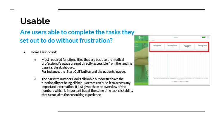
Dashboard/Home:
The primary call to action which leads the medical professionals to the main task has been put on top of the screen which was the case missing in our heuristic analysis but was essential to our user’s journey.
Active patients have been labeled as per their health status which they update regularly through the EONMED app. This will allow doctors to easily identify patients who might be in a Concerning State of health (indicated by the red label) along with Patients who have updated their Credentials and those who have delayed so.

Search Bar:
The search bar has been added to increase easy navigation to required information about a certain patient through their phone number or name.
Consultation Screen:
-
Doctors’ VOC indicated language has been used to create the content for all three parts of this screen.
-
Once the consultation ends, the functionality of reviewing the information the filled during the consultation for increased accuracy is added. Once reviewed and shared, Doctor gets the post-click message confirming the Presciption has been shared with the patient.


Consultation Screen:
The screen has been categorized in 3 main parts which contain several elements that will come in handy during the consultation process.
-
The left part being the context on patient’s personal details, any allergies or chronic conditions along with the history of the previous consultation they took on the app from the same or a different doctor. Doctors had reported in the interviews how important the context of the patient and the previous Doctor’s notes were to them. Such information is made readily available on the screen for them to refer with ease.
-
The middle part is of the video screen which is much bigger and better than before. The size is optimal for both laptop and tablet screens (devices doctors will generally prefer using through the process). Doctors can now make it full-screen as well.
-
The format of the inputs on the left has been standarized for uniformity in investigation data with missing features like Episodes, Time and Notes being added just like the Doctors wanted. They can also maintain the Patient’s past medical report now.


Active Patients Screen:
While the overview is there on the dashboard, clicking on the view button navigates doctors to the Active Patients Screen. Every consultation that the patient takes is represented through a card that reflets the date & time and the status of health and submissions made. Color hierachy is used to easily differentiate a healthy patient from a concerning one and an unwell patient from a severe case. Left menu would show details of all the active patients that the Doctor can navigate through their name and date of the last consultation. Patients who are not active on the consultations automatically get downgraded in the hierarchy with the most active/recent ones appearing at top.
Doctors can view the last recorded submission of credentials in detail by clicking on the submission/status.
Ultimately, all the features doctors might need to navigate to have been made accessible through the dashboard.

-min.png)